 Nowadays Google Adsense is the common and best way to earn money through blogs and websites. It is one of the familiar earning of income which drives blogs and websites. Earning through blog and websites mainly considers the placement of Adsense. Google Adsense place mainly affects the click-through rate and overall earnings. Earning the income through Adsense matters the placing of ads and enriching the content in blogs and websites. If you place the ads perceptively automatically, click rate and overall earnings will get increases. Lastly, I will explain how making the blog effective with Adsense Ad units by 8 simple tips which are easy to understand and carry out.
Tip 1. Use the best performing ad units in your website or blog to increase CTR(click rate)
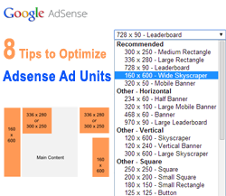
The top three ad units which help in making the blog effects are 336×280 large rectangle, 300×250 inline rectangle and 160×600 wide skyscraper. They bring out effective blog which helps in optimizing Ad units. Implement these ad units and also keep in my mind that other formats also make your blog effective based on website and blog design.
Tip 2. Preferred to choose a blue color for links to motivate the people to click on the link
Best suitable color for links is blue. Most of the main websites use blue color for links. So pick a blue color for links from major website’s links are characterized by blue color.
Tip 3. Choosing colors which match your website design
If you are not satisfied with blue color for links then choose the best color based on your website or blog design. Go for electing color which matches your website or blog design. (i.e. If you have chosen green links then make the Adsense links of the same color).
Tip 4. Go for doing experiment with dark theme and contrast color scheme for ad units
Make the combination of colors properly so that it gives a harmonious look to blog or website. Mix the blog thoroughly if your website has a light color scheme and contrast (border, contrasting background) the units if your blog has a dark color scheme. Make all this correction so that it gives good results to your blog.
Tip 5. Use the borders based on placement of ad units
You should not use borders to Adsense Ad units if you want to place them within the content your blog or website. You should think of using borders to Ad units if you want to place the Adsense units outside the content.
Tip 6. Use tricks to avoid color blindness
If only repeated visitors are visiting often your website then you should think of the rotating background color of ad units to cut ad blindness
Tip 7. Before removing advertising from your website discusses with Ad units providers.
Just think of removing advertising from your website or blog if message has been sent by advertising units. To do so, you should look at your account option in control panel. In that you should disable “On-site Advertiser Sign-Up” feature.
Tip 8. Play with colors and designs to achieve effective website or blog.
Do observation, evaluation on your website or blog with different designs, colors of Ad units. Finally come up with fine tuned Adsense units which give good results with more earnings.
Conclusion
There are more tips will be available on internet to make your blog or website effective with Adsense Ad units. Google Adsense is the best way to earn money by using simple ideas. To make your blog effective you should know the strategies of placing the ad units and choosing the colors and designs for your website or blog. Test the blog or website with different designs and different colors for Adsense Ad units until you get fine tuned results. Addsense units are the familiar and easy to earn money online. This is best online internet marketing strategy to advertise the products and other things.
Use all these tips in your website to achieve good CTR (click rate) and increase the revenue from Adsense Ad units.


