 Color is more than just an aesthetic choice—it’s a powerful psychological tool that can influence customer emotions, perceptions, and buying decisions. In marketing, understanding the psychology of color can help brands create stronger connections with their audience, improve brand recognition, and boost conversions. This guide explores how colors affect behavior, offers tips on choosing the right color palette, and provides real-world examples of effective color strategies in marketing.
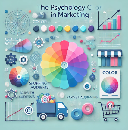
Why Color Matters in Marketing
Studies show that up to 90% of snap judgments about products are based on color alone. Colors can:
- Trigger emotions: Colors evoke specific feelings that influence decisions.
- Improve brand recognition: Consistent use of colors increases brand awareness by up to 80%.
- Drive conversions: The right color can make CTAs more noticeable and persuasive.
The Psychology of Popular Colors
Here’s how different colors can affect customer perceptions:
1. Red – Passion, Urgency, and Excitement
Red creates a sense of urgency, making it ideal for clearance sales or limited-time offers.
Example: Many fast-food chains like McDonald’s and KFC use red to stimulate appetite and encourage quick decisions.
2. Blue – Trust, Security, and Professionalism
Blue is calming and conveys reliability. It’s popular with financial institutions and tech companies.
Hint: Use blue in industries where trust is critical, such as healthcare, finance, or IT.
3. Yellow – Optimism, Energy, and Attention-Grabbing
Yellow is bright and attention-grabbing, but overuse can cause visual fatigue.
Advice: Use yellow for accents or CTAs to draw attention without overwhelming the viewer.
4. Green – Growth, Health, and Tranquility
Green symbolizes nature, health, and balance. It’s widely used in eco-friendly and wellness brands.
Example: Whole Foods uses green to align with its focus on natural and organic products.
5. Orange – Enthusiasm, Confidence, and Creativity
Orange is energetic and fun, often used to create a sense of excitement.
Tip: Use orange for CTAs like “Buy Now” or “Subscribe” to encourage action.
6. Purple – Luxury, Wisdom, and Creativity
Purple conveys sophistication and luxury, often associated with premium products.
Hint: Use purple in industries like beauty, fashion, or high-end services.
7. Black – Elegance, Power, and Sophistication
Black is sleek and modern, often used in luxury brands to convey exclusivity.
Example: Apple uses a minimalist black-and-white color scheme to emphasize elegance and simplicity.
8. White – Simplicity, Cleanliness, and Minimalism
White creates a sense of space and clarity. It’s commonly used in modern web design to enhance readability.
How to Choose the Right Colors for Your Brand
Selecting the right colors depends on your target audience, brand identity, and marketing goals.
1. Understand Your Audience
Different demographics respond differently to colors. For example, younger audiences might prefer bold, vibrant colors, while older demographics lean toward more subdued tones.
2. Consider Cultural Differences
Color meanings vary across cultures. Red symbolizes luck in China but can represent danger in Western countries.
3. Align with Your Brand Personality
Your brand’s values should influence your color choices. A playful, energetic brand may favor bright colors, while a luxury brand may opt for darker, more sophisticated tones.
Using Color in Marketing Strategies
1. Website Design
Colors influence how users navigate your site. Use contrasting colors for CTAs to make them stand out.
<button style=”background-color: #FF5733; color: white;”>Get Started Now</button>
2. Social Media Campaigns
Bright, bold colors can increase engagement on platforms like Instagram and Facebook.
3. Email Marketing
Use colors strategically in email CTAs to improve click-through rates.
Advice: Test different color combinations in A/B tests to see which ones drive more conversions.
4. Packaging and Product Design
Product packaging colors can influence purchasing decisions on the shelf.
Common Mistakes to Avoid with Color in Marketing
- Overusing Bold Colors: Too many bright colors can overwhelm users.
- Ignoring Color Contrast: Poor contrast affects readability and accessibility.
- Inconsistent Branding: Changing color schemes frequently can confuse your audience.
- Not Considering Accessibility: Ensure your color choices are accessible to colorblind users by maintaining high contrast.
Real-World Examples of Color Psychology in Action
- Coca-Cola: Uses red to evoke excitement and passion, reinforcing brand energy.
- Facebook: Blue conveys trust and security, aligning with its global social platform.
- Starbucks: Green reflects growth and relaxation, creating a calming environment for coffee lovers.
Expert Advice for Using Color Effectively
- Test and Optimize: Conduct A/B tests to determine which colors resonate with your audience.
- Leverage Contrast: Ensure your CTAs stand out with contrasting background and text colors.
- Stay Consistent: Maintain a consistent color palette across all marketing materials to strengthen brand recognition.
Conclusion
Color isn’t just a design choice—it’s a strategic marketing tool. By understanding how colors influence customer behavior, you can create more effective marketing campaigns that capture attention, evoke emotions, and drive conversions. Whether you’re designing a website, crafting social media posts, or developing product packaging, the right color strategy can make all the difference.


