
macfais
New member
- Joined
- Nov 6, 2017
- Messages
- 29
- Points
- 0
Guys I am facing new problem with my website. My website appears bad in tablet mode.
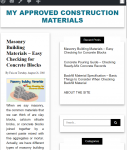
Photos shown is at screen width 768px before the side bar collapse to the bottom. My site content compressed into 292px and the widgets (sidebar) occupies a lot of space at aroound 425px width.
I want the side bar to collapse to the bottom of my content at screen width 985px with site content and site bar ratio (60:40) before collapsing.
Help me guys and please do not go technical on me. I am just a newbie. I have zero knowledge. All is based on my self-study.
PS: I am using wordpress pre-defined themes. I am just modifying it through additional CSS option.