nesito29
New member
- Joined
- Mar 26, 2015
- Messages
- 158
- Points
- 0
You might have heard this before but, first impressions matter, especially online!
This post is meant to help you understand a little bit better how people perceive your website and how you can improve your overall design.
The information here included has been obtained by interviewing influencers and experts in web design, hope it helps you =).
Let me share with you what science says about your website and brand for marketing purposes.
Let me start by showing you the science of colors.
This is backed up by many studies and you can Google it up if you want, I'm sure you'll be able to easily find it.
Anyway, let's get started.
The Science of Colors In Marketing
I'm completely sure you already know this but, we are very visual beings, which is why colors are they way we interact and perceive the world.
Choosing the right combination of colors could end up improving your conversions. Kepp reading, this could help you out
Which colors trigger which feelings?
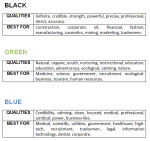
The logo company came up with an amazing infographic where they explain what colors are best for each company and why. Here's what they said:
Knowing what colors to use on your properties will make it not only look better but, also, to be received a lot better by your audience.
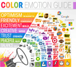
If we take a look at what big brands out there are doing, a lot of their color choices are very obvious. Every one of these companies seeks to trigger a very specific emotion:
This is especially used when we want to buy something, colors can play a major role.
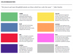
Here's a showcase of the meaning behind colors.
Even though colors are important, there are other factors that should be considered like fonts.
Fonts, really?
Yeah.
Let me explain.
Typography is a fundamental element in any web design work that you do. The reason we hire website designers is so they can provide an experience that provides helpful content for our audiece.
Having a solid typographic base will help us display content in a way that users can consume effectively.
While there are other design elements on a website, content is what we consider the most, and as designers, it is their job to enhance projects with selection and use of typography.
According to The Layout, the differences between a "Font" and a "Typeface" are:
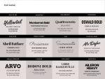
A while ago, I came across a very cool guide written by Canva about fonts and their meaning. So I created images of them.
The following image will tell you in what situation to use them.
Also, here's Google's list of fonts, utilizing the ones they have in store will benefit your overall design.
All of this sounds very technical and complicated, however, it's really not, it's easier than what you might think.
Understanding the basics is very important and you don't really need to be an expert but, you, at least, need to know what to look for in great web design (especially if you are hiring someone to design your website).
I hope this helped you understand how people perceive your website when they come to it and how you can improve it.
If you have any questions or comments, please let me know below =)
This post is meant to help you understand a little bit better how people perceive your website and how you can improve your overall design.
The information here included has been obtained by interviewing influencers and experts in web design, hope it helps you =).
Let me share with you what science says about your website and brand for marketing purposes.
Let me start by showing you the science of colors.
This is backed up by many studies and you can Google it up if you want, I'm sure you'll be able to easily find it.
Anyway, let's get started.
The Science of Colors In Marketing
I'm completely sure you already know this but, we are very visual beings, which is why colors are they way we interact and perceive the world.
Choosing the right combination of colors could end up improving your conversions. Kepp reading, this could help you out
Which colors trigger which feelings?
The logo company came up with an amazing infographic where they explain what colors are best for each company and why. Here's what they said:
Knowing what colors to use on your properties will make it not only look better but, also, to be received a lot better by your audience.
If we take a look at what big brands out there are doing, a lot of their color choices are very obvious. Every one of these companies seeks to trigger a very specific emotion:
This is especially used when we want to buy something, colors can play a major role.
Here's a showcase of the meaning behind colors.
Even though colors are important, there are other factors that should be considered like fonts.
Fonts, really?
Yeah.
Let me explain.
Typography is a fundamental element in any web design work that you do. The reason we hire website designers is so they can provide an experience that provides helpful content for our audiece.
Having a solid typographic base will help us display content in a way that users can consume effectively.
While there are other design elements on a website, content is what we consider the most, and as designers, it is their job to enhance projects with selection and use of typography.
According to The Layout, the differences between a "Font" and a "Typeface" are:
A typeface refers to the set of typographical symbols and characters: letters, numbers, and any characters that let us put words on our website.
It is the design of the alphabet, basically the shape of the letters that make up that style. When we refer to Helvetica, we are referring to a typeface.
A font is defined as the complete character set within the typeface, often referring to a particular size and style.
Helvetica Bold 10 point is a way to reference a font. Fonts are specific to the files that contain all the characters and glyphs within the typeface.
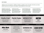
A while ago, I came across a very cool guide written by Canva about fonts and their meaning. So I created images of them.
The following image will tell you in what situation to use them.
Also, here's Google's list of fonts, utilizing the ones they have in store will benefit your overall design.
All of this sounds very technical and complicated, however, it's really not, it's easier than what you might think.
Understanding the basics is very important and you don't really need to be an expert but, you, at least, need to know what to look for in great web design (especially if you are hiring someone to design your website).
I hope this helped you understand how people perceive your website when they come to it and how you can improve it.
If you have any questions or comments, please let me know below =)


